Octagon Theatre, Bolton
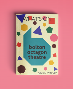
Octagon Theatre, Bolton were undergoing a complete regeneration and wanted a new visual identity to go with their new building. They were clear that they wanted something that was bold, community driven and as diverse as their town.
My response to this brief was firstly to change the name slightly to Bolton Octagon Theatre, to highlight their pride in place rather than it just being an address at the end of the name.
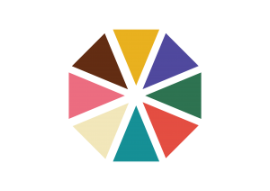
For my Bolton Octagon Theatre rebranding, the colours I have chosen are bold, fresh and playful. However, they still have a seriousness and warmth to them. By having such a large selection, it gives multiple options to suit the purpose.
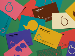
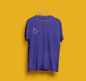
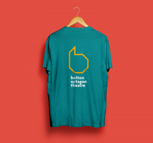
This mark is easy to use in any context. It translates well as a small mark as well as large. It can be used to create repetitive patterns, or as one big mark and works as both an outline or with a fill.
\/’
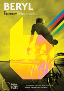

The marks and colours can be used in conjunction with promotional images for the productions being advertised. By using an overlay, the main image is still the focus, but the theatre branding is strong and easily identified.
Agenda is a high style san serif typeface that has a fresh feel to it. Its round letters feel open and there are beautiful playful inflections on the tails and terminals. These angles compliment the sides of the octagon shape. Making full use of different fonts within this typeface feels secure and strong.
Habibi is a great accompanying typeface. This serif has visual similarities to Agenda and is highly legible for body copy.
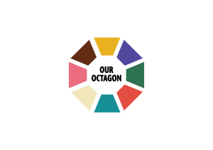
As part of the Bolton Octagon Theatre rebranding, they wanted sub brands for a membership scheme and a restaurant. The membership scheme will make your loyal patrons feel important and a part of the Octagon family. This mark includes all the colours previously used, to show the diversity of your audience. I have played with the idea of ‘Our Octagon’ to continue with your theme of community, and putting this at the heart of the mark.
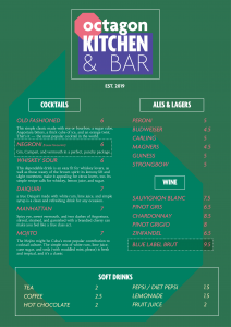
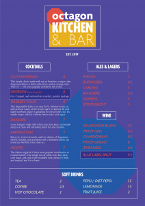
If you are interested in my other branding projects, see Millport Ales.

